Inside this story
A playful picture can reward two readings: the shape you recognize immediately and the small visual relationship you notice a moment later. I Love Doodle, the work of Lim Heng Swee, is a good place to practice that slower second look.
The useful starting point is the artist’s own collection, rather than a room photograph with an attractive frame. Open a few works, compare them at different sizes and ask which idea you would still enjoy after the first surprise.
Start with the artist and his own collections
Lim Heng Swee identifies himself as the illustrator and graphic designer behind I Love Doodle on his official site. His shop organizes the work into named collections, including Cat Landscape, Cat and Plant and Overthink.
Those collection names give you useful routes into the work. Rather than scrolling through everything at once, pick a direction and compare three pictures from it. Then visit another collection to see whether the relationship between subject, shape and mood changes.
For a specific starting point, open Cat Landscape 34. Use the artist’s images to study the actual print and its available formats; the exercise below applies equally to another work that catches your attention.
Look twice before reading the title
First, look at the picture without explaining it. Identify the largest dark or light area and notice where your eye goes. Does the outline suggest a character, a setting or an everyday object first?
Next, read the title and look again. Notice whether the words reveal a relationship you missed or simply confirm the first reading. A visual joke can depend on the edge between two shapes as much as on the shapes themselves.
Try writing two short sentences:
- “At first I see…”
- “When I look again, I notice…”
If the second sentence only repeats the first, choose another image or give the picture more time. This is a looking exercise, not a test you have to pass. You may prefer an image for its composition even when the visual joke is immediately clear.
Compare three directions in the collection
Cat Landscape: start by comparing silhouette and setting. Ask how the largest shapes organize the picture and what remains readable at a small size.
Cat and Plant: compare the way the two subjects occupy the frame. Look for balance, repetition and the gaps between forms. Notice whether you prefer a denser composition or more open space.
Overthink: begin with mood. Compare how the title and image work together, and which picture you would want to encounter on an ordinary day.
Keep the official collections open alongside your notes so the artwork itself remains the reference. Your reading can change as you compare more than one image.
Choose the size before choosing the wall
Once you have a favorite, measure the space. Mark the proposed frame’s outer dimensions with removable paper or a suitable temporary guide. Stand where you will normally see it, then sit down if it will hang above a desk or reading chair.
A small frame encourages a close look; a larger piece has to work with the room from farther away. Neither is automatically better. Check the print size, surrounding border, orientation and frame dimensions separately so you know what you are measuring.
Compare a simple geometric picture in the three room studies below, then apply the same placement questions to the artwork you choose.
Swipe to explore, or choose an example below.
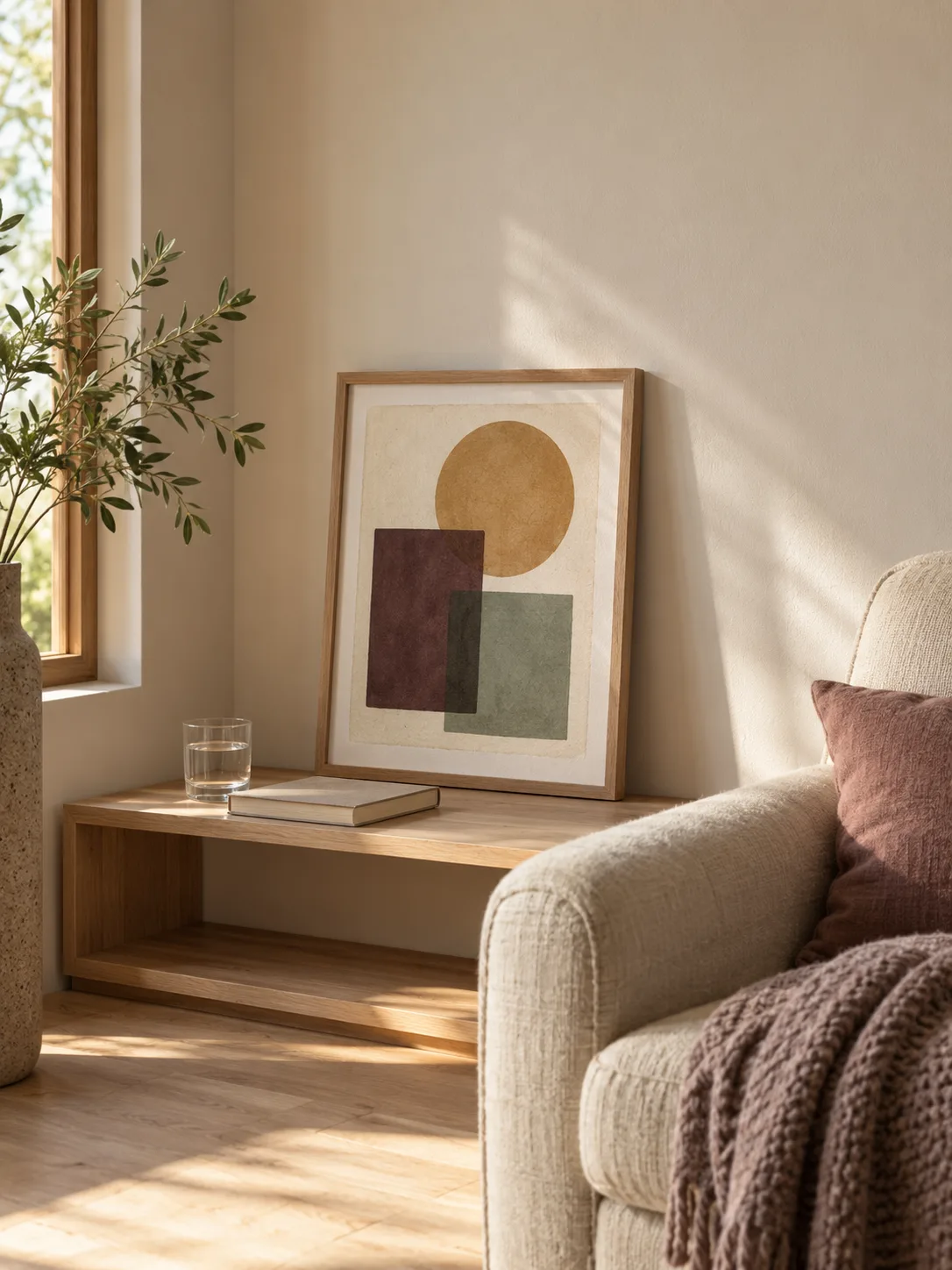

Start with a small corner
A shelf-height frame rewards a closer look. Keep nearby objects few enough that the picture has a clear place in the room.
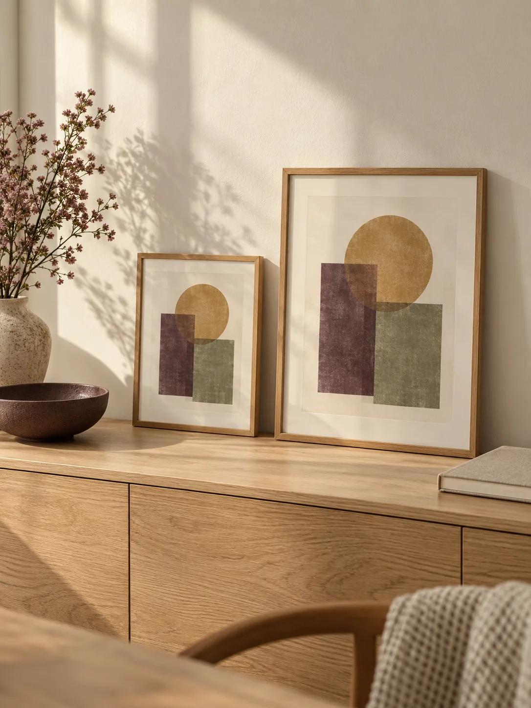
Compare the scale
Look at the available wall and the viewing distance together. A familiar notebook helps make the two frame sizes easier to judge.
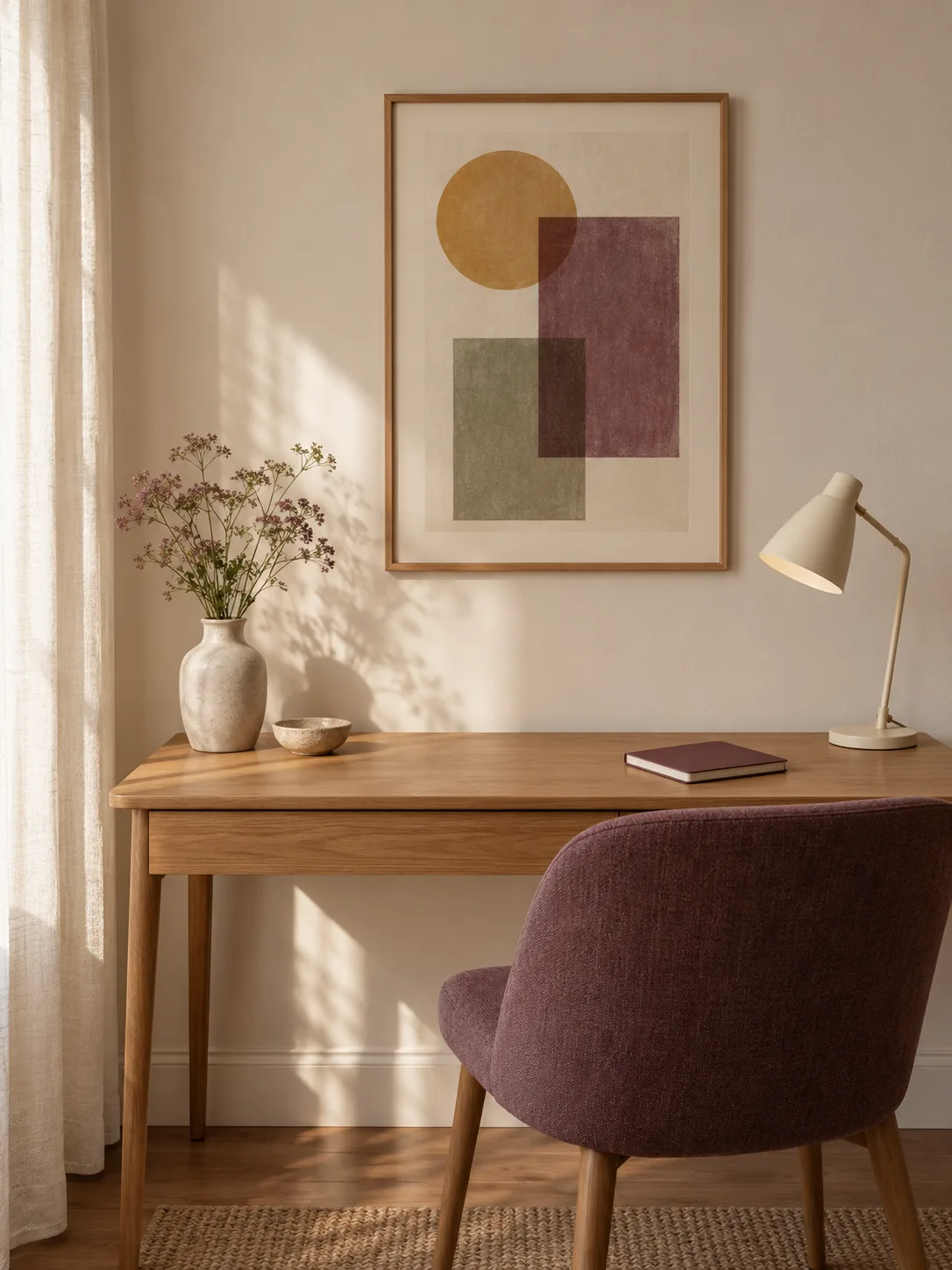
Leave a little quiet wall
Give the frame room to stand on its own. One lamp and a useful clear desk can make a modest picture feel considered.
Before ordering, check the selected listing for its materials, dimensions, framing details and current shipping terms. A styled room picture helps establish a mood, but it cannot replace measurements.
Build a small collection with a point of view
If you want several pieces, choose the relationship that holds them together. It might be a recurring subject, similar proportions or a shared emotional tone. Matching every color is only one possibility.
Try laying out paper rectangles at the intended frame sizes before buying a set. Leave enough space between them to read each image independently. A busy neighboring poster or patterned object can change how easily a quiet visual idea is noticed.
Save your favorites and return to them later. Which image do you remember without reopening the page? Which one would you choose even if the room changed color? Those questions move the decision beyond decoration and toward something you enjoy looking at.
For another example of familiar shapes taking on a second identity, read the story behind hamburger shoes.